The Power of Typography in Military History: A Critical Look at Fonts in “Army Vehicle Marking”
In the realm of typography, Manfred Klein, born in 1932, has left an indelible legacy. His influence extends not only to various aspects of the field but also reaches into the domain of marking military vehicles. This article takes a critical look at the importance of typographic consistency in Army Vehicle Marking, with specific attention to the issues surrounding the use of fonts such as “Stencilia” and “DIN.”
Manfred Klein, a pioneer in the world of type design, has made a lasting impact on the typographic landscape through his contributions. His life story, a testament to the evolution of type design, encompasses a remarkable personal journey that has left its mark on the latter half of the twentieth century. In the early ’50s, Klein attended evening courses under the famous Günter Gerhard Lange, later undergoing thorough typesetting training. His academic path led him to the Meisterschule für Graphik und Buchgewerbe in Berlin. As an entrepreneur with a preference for substantive depth over visual aesthetics, Klein was actively involved in various disciplines.
Klein’s career took a remarkable turn in the early ’80s when he sold his agency to the New York advertising firm Ogilvy. This event not only marked the end of an era but also signaled a renewed focus on his love for typography.
His early works, created for Apply, Alphabets, and Fontshop in the ’90s, illustrated his innovative approach to type design. Amidst the rapid digitization of fonts and the rise of computer-generated letters, Klein’s contributions stood out like a breath of fresh air. His Quill script, along with his comic dingbats, belonged to the pioneering “eccentric” surprises in original fonts.
One of Klein’s notable contributions is the digitization of Gutenberg’s type, a crucial moment in the history of type design. While later attempts have been made to replicate this achievement, none have captured the same groundbreaking essence as Klein’s original effort.
On his 70th birthday, Apostrophe (Fredrick Nader) aptly called Klein the “Mark Twain of type.” This characterization reflects not only Klein’s enduring presence in the field but also his sharpness, creativity, and ability to infuse humor into his work. Particularly, his “Birds and Witches dingbats” were praised as the very first “funnybats” ever created.
Klein’s portfolio includes a diverse range of creations and revivals of stencil types, such as “ABCThru,” “AeroSans,” and “Stencilia.” His work demonstrates meticulous attention to detail and a commitment to pushing the boundaries of typographic expression.
Despite the challenges of Typoasis closing in 2017, Petra Heidorn ensured that Klein’s free font collection remained accessible by moving it to current web pages where one can often download fonts for free. This act of preservation underscores the significance of Klein’s contribution to the typographic landscape.
As we reflect on the legacy of Manfred Klein, it is clear that he was not just an observer but actively contributed to the evolution of typography. His influence goes beyond the characters on a page; it extends to the core of how we perceive and interact with written language. Manfred Klein, the Mark Twain of type, undeniably earned his place as a pioneer in the rich history of type design.
Manfred Klein created and digitized hundreds of fonts, many of which were made freely available.
The Importance of Typographic Consistency in Military Vehicle Marking: A Critical Examination of Fonts such as “Stencilia” and “DIN”
At “Army Vehicle Marking,” we aim for historical accuracy and typographic consistency that honors the heritage of Allied military vehicles during the period 1939-1945. In this exploration, we delve deeper into the crucial importance of typographic choices, with particular attention to the issues surrounding the use of fonts like “Stencilia” and “DIN.”
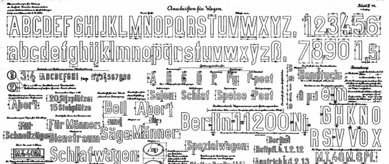
In the world of typography, Manfred Klein is an undisputed pioneer, and his contributions to the landscape of type design are invaluable. However, applying fonts to Allied military vehicles raises questions about suitability and historical connotations, especially when considering “DIN,” issued by the “Deutsches Institut für Normung” (DIN), and its derived fonts like “Stencilia” and “Stencilia-A” from the digital era of the ’80s/’90s, which unfortunately are frequently seen on meticulously restored military vehicles.
“DIN,” rooted in Germany and originally known as “Das Ist Norm” and “Deutsche Industrie-Norm(en),” has historical ties to German standardization and industrial standardization. These associations may raise questions about the appropriateness of “DIN” on vehicles of Allied forces, given the historical context.
The aesthetic character of fonts like “Stencilia” and “DIN” also deserves attention. While Manfred Klein excelled in creating diverse and innovative fonts, the characteristics of “Stencilia,” “Stencilia-A,” and “DIN” may not have the desired effect on Allied vehicle marking.
Instead of clinging to fonts with historical or formal connotations, a consideration of fonts that are historically more suitable and correct for Allied forces might be more appropriate.
In conclusion, as we celebrate the heritage of Manfred Klein, it is essential to think critically about the choice of fonts for your military vehicle. Striving for typographic consistency on Allied vehicles should go hand in hand with avoiding potentially charged fonts and selecting an approach that reflects the operational goals of the armed forces. “Army Vehicle Marking” is committed to ensuring both historical accuracy and typographic consistency, giving your vehicle the authenticity it deserves.

